
Modern photography through a different lens: exploring how to make the process of taking and storing photos more efficient, intentional, and meaningful.
OVERVIEW
Curate is a photo taking and storing app that assists everyday photographers in making room for the photos that mean the most to them. Users can remove the clutter of photos they don’t want to keep and capture photos that they find most meaningful.
PROJECT TYPE
Concept project created to explore and apply UI/UX Design practices and frameworks taught via Springboard
MY ROLE
UX Designer, UI Designer
THE CHALLENGE
Photo Taking and Storing
Since the first cell phone with a built-in camera was introduced in 2000, photography has become more accessible to everyone. Now, you can capture thousands of everyday moments with a few simple taps and carry them in your pocket. As a result of this, users have stated that they often run out of phone storage, as their photo galleries have quickly become flooded with images that they don’t always need or want.
How might we reimagine the process of taking and storing photos so as to help people remove the clutter of “bad” photos and capture the moments that mean the most to them?
THE APPROACH
Design Thinking
“Design thinking is a human-centered approach to innovation that draws from the designer’s toolkit to integrate the needs of people, the possibilities of technology, and the requirements for business success.”
Using the iterative, human-centered approach of design thinking allowed me to understand users, define the problem, and create innovative solutions to test. This pushed me to shift my complete focus to the user.
My high level goals for the project were to:
Identify potential users and discover their needs, pain-points, and frustrations.
Ideate and design possible solutions to make the process of taking and storing photos more efficient, intentional, and meaningful.
Validate solutions and measure impacts.
THE DISCOVERY
Understanding users through research
The purpose of the discovery phase was to dive deeper into the problem space. I wanted to understand the challenges people with storage problems faced and the techniques they used to work around it. I kicked off this exploration by collecting data via articles online and validating the problem through a simple 8 question survey with 65 participants. From there, I identified user needs, behaviors, and pain points through a series of 6 conversational interviews with potential users.
Quantitative
96.9% of people use their smartphone camera as the main tool to take photos.
While film photography has become more popular in recent years due to its nostalgic feel, users depend on their smartphone camera the most.
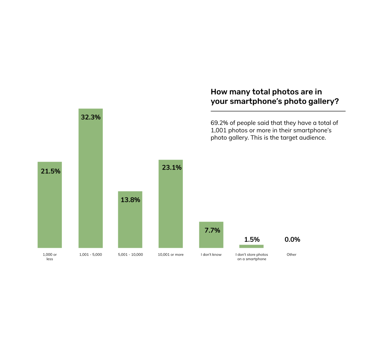
69.2% of people said that they have a total of 1000 photos or more in their smartphone’s photo gallery.
More than half of participants noted that they had more than 1000 photos saved, with 23.1% having a total of 10,000 or more.
44.4% of people said that they rarely or never sift through their photo gallery to delete photos they don’t want.
Although many have claimed that they have run out of storage space on their phone before, close to half rarely-never sift through their photo gallery to reduce their photo gallery volume. This hints that they have found other ways to workaround this challenge.
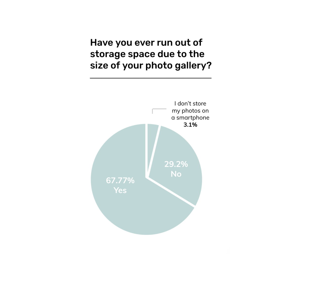
67.77% of people said that they have run out of storage space due to their photo gallery.
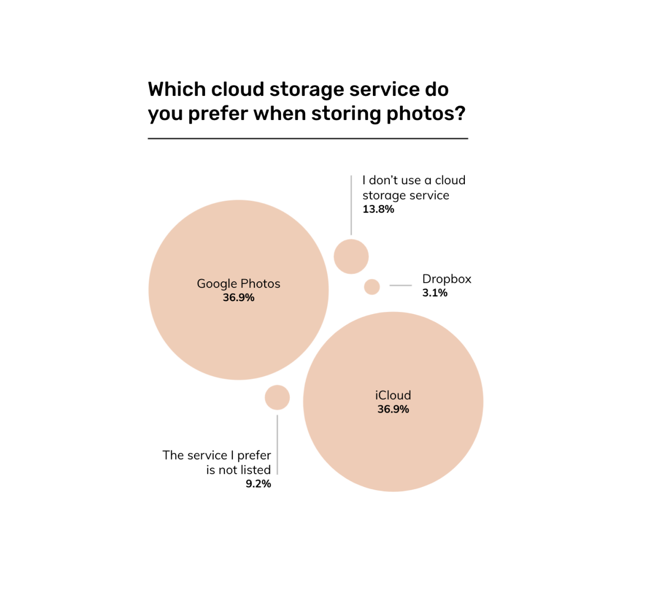
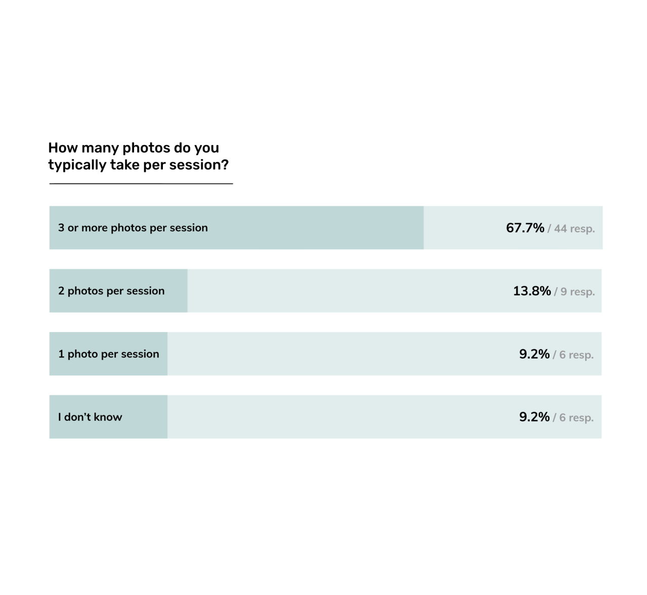
Additional statistics from the survey are presented below:


Qualitative
When asked about old photos, participants spoke fondly of their collections, noting how each photo brought back specific memories that molded their life into what it is today. On the other side of this, they mentioned that the volume of their photo gallery had gotten out of hand because they often took too many photos, without deleting the bad ones.
Notable quotes and photos of the affinity map process are included below:
“I hoard all my photos. They’re there forever…It can be frustrating if I have a lot of photos and a lot of them are bad.”
— Robin
“If I run out of storage, then I have to go out of my way and delete photos, and that’s a lot of work.”
— Nancy
“I’ve got too many copies of the same [moment]…And I haven’t disciplined myself to delete the ones I should.”
— Sandy
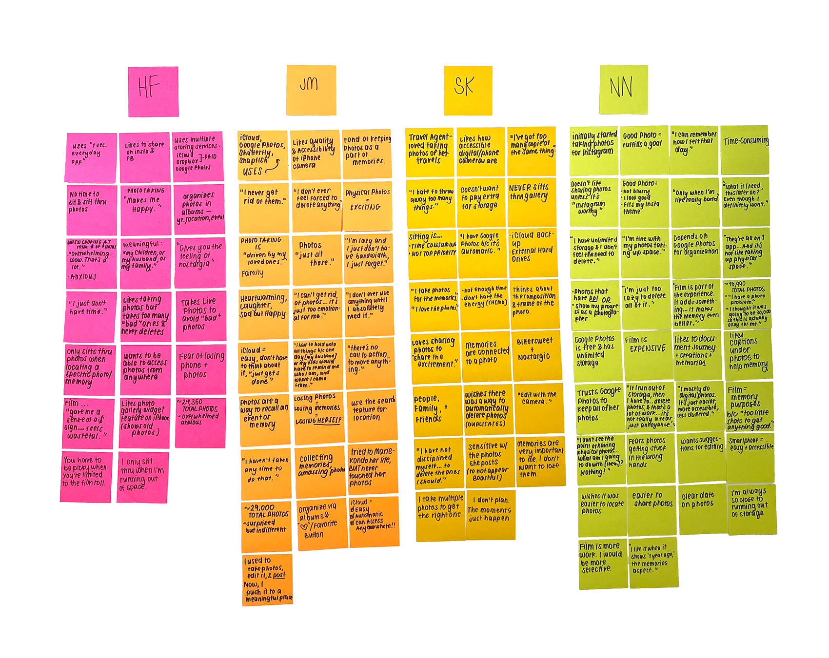
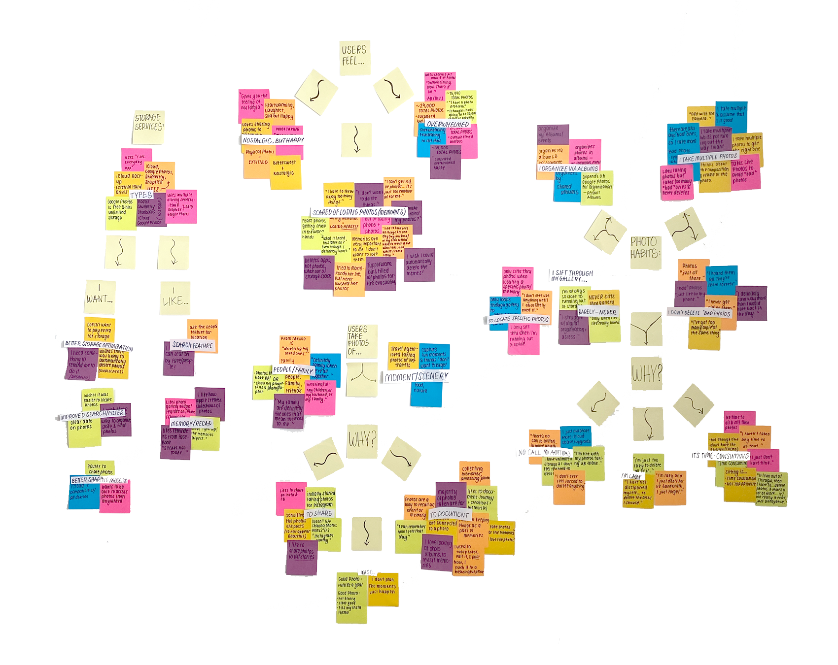

From the user’s POV
After pinpointing the main user needs and analyzing the research, I identified differentiating factors that segmented the target audience into 2 groups. These factors had to do with the “why” behind taking and storing photos and the photo storage problem. From the data, there was a trend in older participants taking and hoarding photos for more sentimental reasons, as opposed to younger participants taking hundreds of photos to get the “perfect” one and neglecting to remove the duplicates later. This may be due to differences in life stages and priorities - busy parents wanted to document everything about their children’s lives, while teens/young adults were focused on photos that enhanced their external image.
Additional differentiating factors are summarized in more detail in the following personas:
THE INSIGHTS
Deeper insights and questions
Before continuing with the ideation process, I condensed the most important points from the research into three main findings. From these findings, I drew additional insights which allowed me to refine and produce more “How Might We…” (HMW) questions.
-
Users take multiple photos per session, often mindlessly
Insight: Smartphone cameras have made it easier to take multiple photos per session, causing people to put less thought into a photo.
HMW: train users to be more selective and mindful when taking photos so they prevent the accumulation of “bad” photos?
-
Users find that sifting through old photos is tedious, so they avoid it
Insight: because the volume of photos brings about feelings of anxiety/overwhelm users tend to avoid cleaning out their gallery. There is no call to action
HMW: make the process of taking/storing photos more of a positive, engaging action that makes the user want to carry it out?
-
Users tend to use a mixture of apps to store their photos
Insight: There is currently no all-in-one solution for photo storage, so users have to outsource photos to different apps.
HMW: help to reduce the number of tools people use to store their photos?
THE FRAMEWORK
Mapping out the experience
Taking the insights I learned from the discovery phase, I began the ideation process with pen and paper. Writing out key “How Might We…” Questions with potential solutions allowed me to see my ideas in a tangible, visual way. With users in mind, I chose to focus on 3 Big Ideas, or concepts, as demonstrated below.
3 Big Ideas:
Photo Criteria - have users establish the photos that mean the most to them.
Making a Plan - setting goals and creating a step-by-step plan of how they will reach them.
Where Does This Photo Belong? - sorting or organizational feature.
I then implemented these ideas into the first rough sketches of the app.
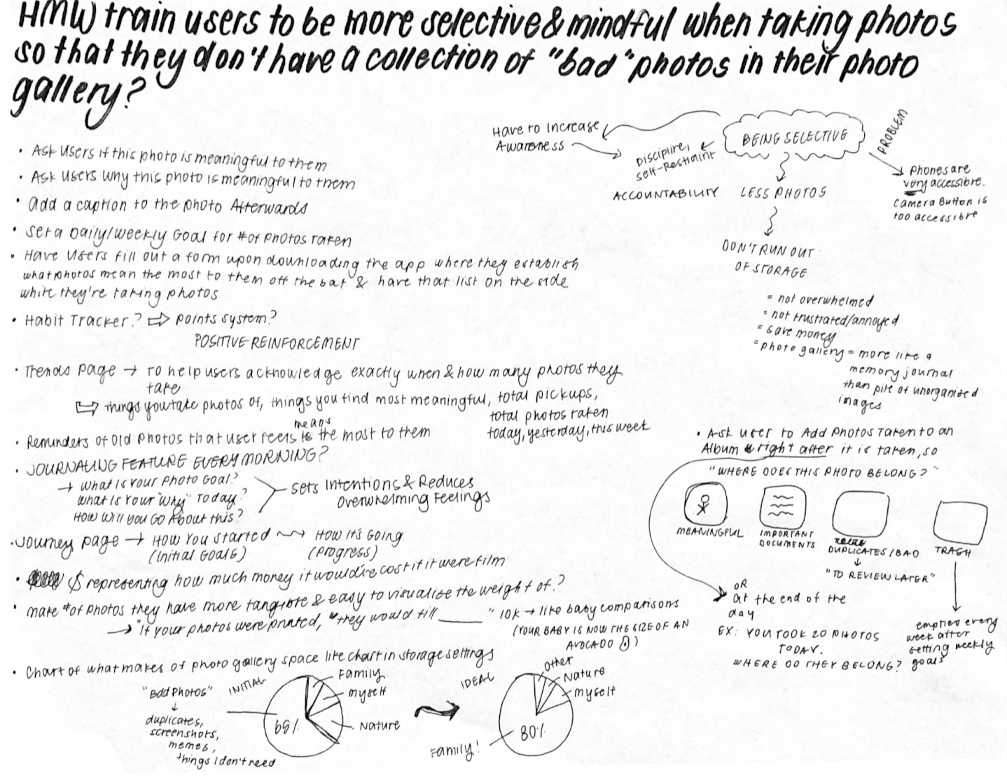

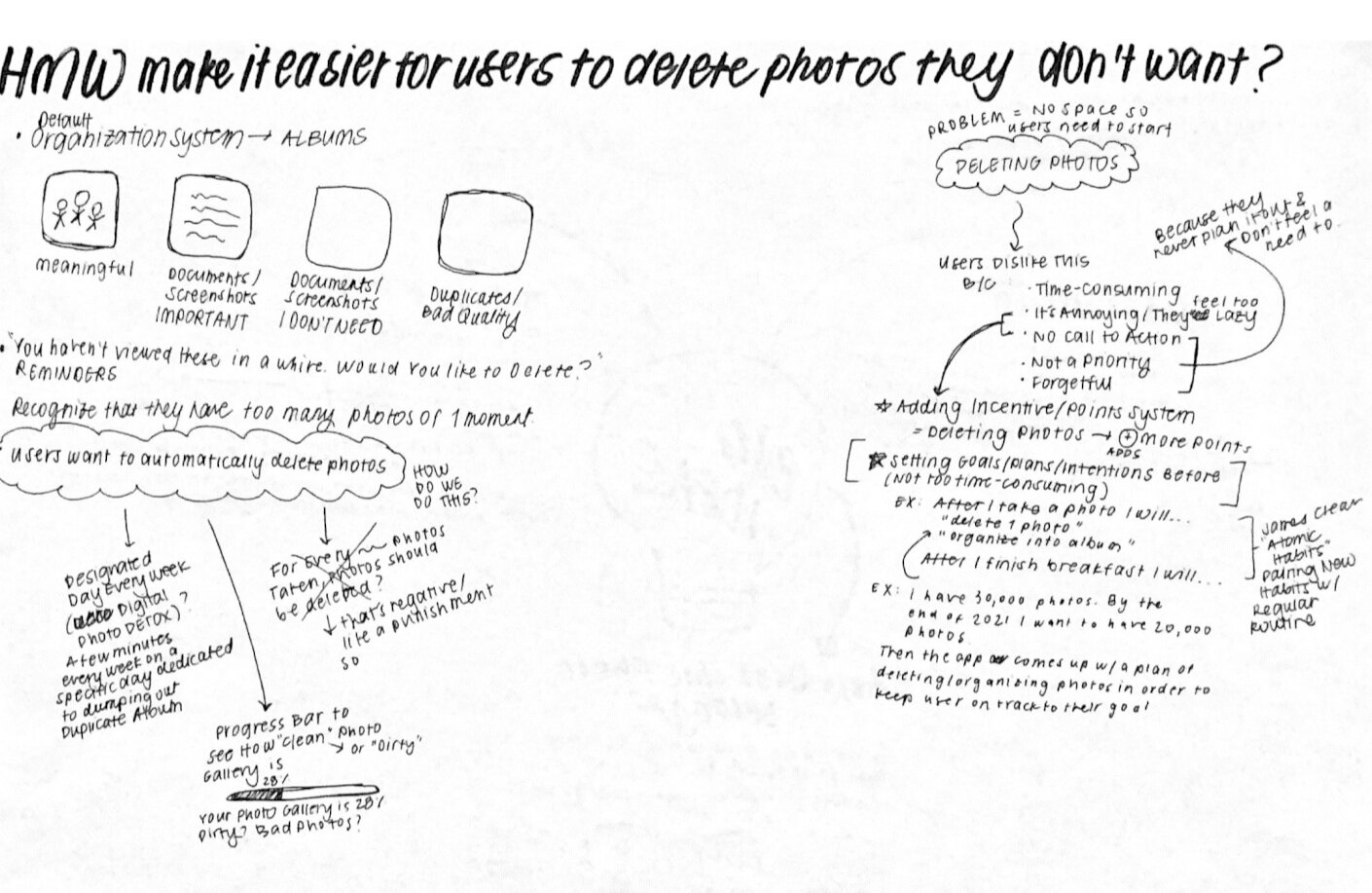


User Stories and Flows
To really see things in perspective, I crafted a few user stories and organized them by priority. This helped me to identify the 5 most critical routes, which were later represented in my user flows.
Some examples of the user stories:
As a user, I want to establish what types of photos mean the most to me so that I can use this list to prioritize the types of photos that I take.
As a user, I want to set photo goals so that I can optimize my storage space.
As a user, I want to search for a photo so that I can show it to others.
As a user, I want to review and delete photos that I don’t need so that I can declutter my photo gallery.
As a user, I want to take photos of meaningful things and people so that my photo gallery is only filled with meaningful things.
⬇️ View the 5 user flows below

As shown in the user flows above, the 5 red route flows are:
Onboarding flow - sign up/sign in & establishing what photos mean the most to them
Capture flow - taking photos of meaningful things and people
Moments flow - viewing, searching, and sharing photos
Sorting flow - reviewing, organizing, and deleting photos
Support/Settings flow - editing account and sharing settings
Evolution of the Designs
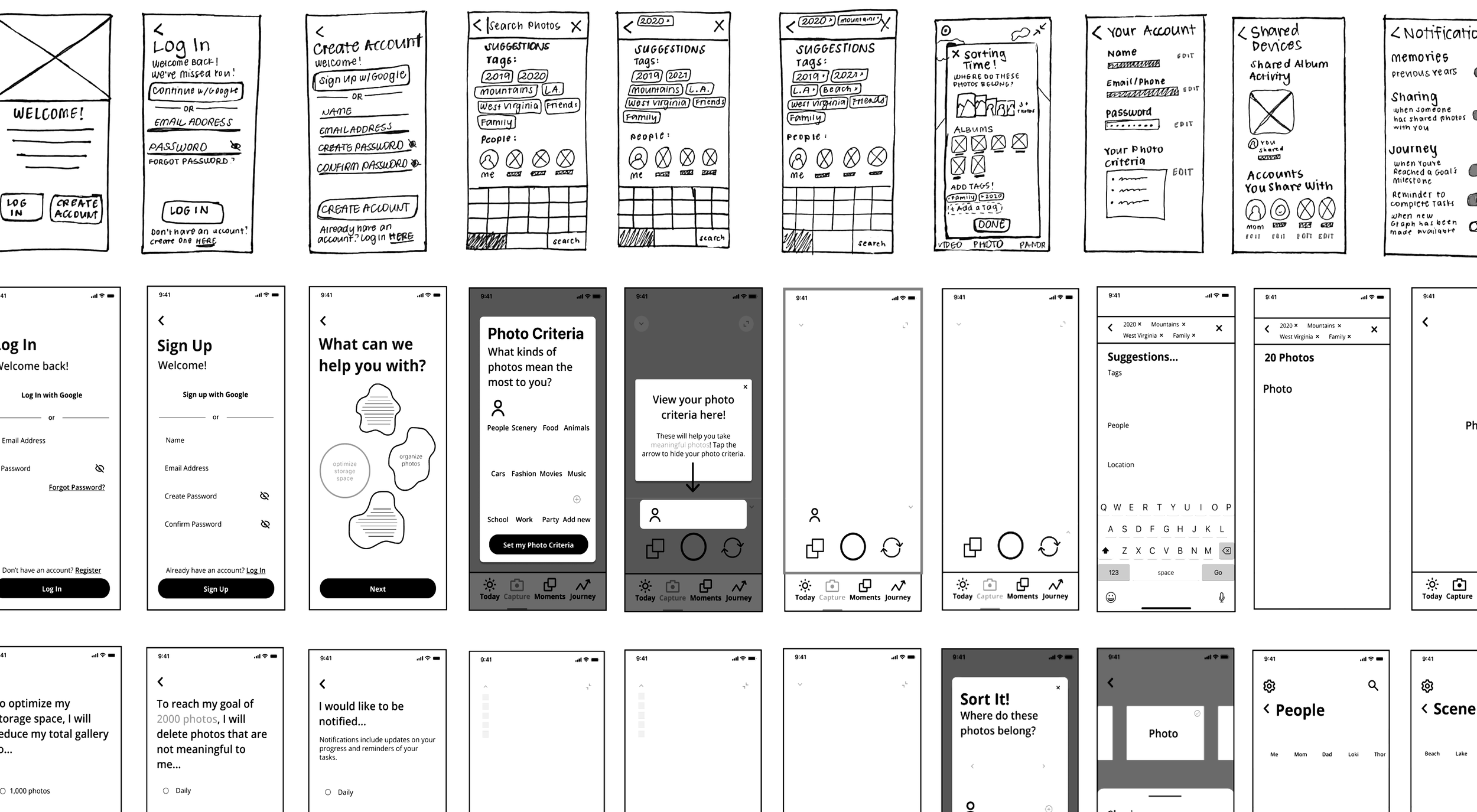
From sketches to wireframes, each iteration worked together as building blocks for the final design. Early sketches were used to validate solutions in the first usability test round. Wireframes were used to further layout the structure and functionality of the app, taking into account the user needs and flows.
YOU ARE NOT THE USER
Refocusing my attention
During the Usability Test sessions, I realized that my view had drifted away from that of the user and towards solutions that were based on assumptions, rather than the user’s needs. For example, I wanted to add a timer to the Sorting photos flow so as to make the action more urgent. But while the timer might’ve pushed some users to sort more and more photos, I found that it caused others to want to leave the app due to additional anxiety and overwhelm that the timer feature induced.
The testing session shifted my mindset towards investigating, rather than validating the designs. Through this, I was able to refocus my attention to what’s most important - the user.
Supplemental reading: “You are not the user: The False Consensus Effect”
BRAND & STYLE
Enter: curate
Curate is a photo taking and storing app that assists everyday photographers in making room for the photos that mean the most to them. Users can remove the clutter of photos they don’t want to keep and capture photos that they find most meaningful.
To bring the designs to life, I put together 2 mood boards to evoke the minimal, yet elegant style that I wanted curate to emanate. The focal point of the imagery mood board are the words “what is your story?”, further highlighting curate’s mission to help others tell their own, unique story through their photos.
The mood boards also contain humble, earthy hues, portraying feelings of warmth and reminding viewers of roots, home, and family. The serif fonts produce a professional and trustworthy feel, pairing well with the abundance of breathing room between UI elements, creating a sleek overall appeal. To ensure consistency throughout the app, I also created a style guide.
⬇️ Scroll through the gallery below to view the mood boards and the full style guide.
DETAILED DESIGNS
High-Fidelity Designs
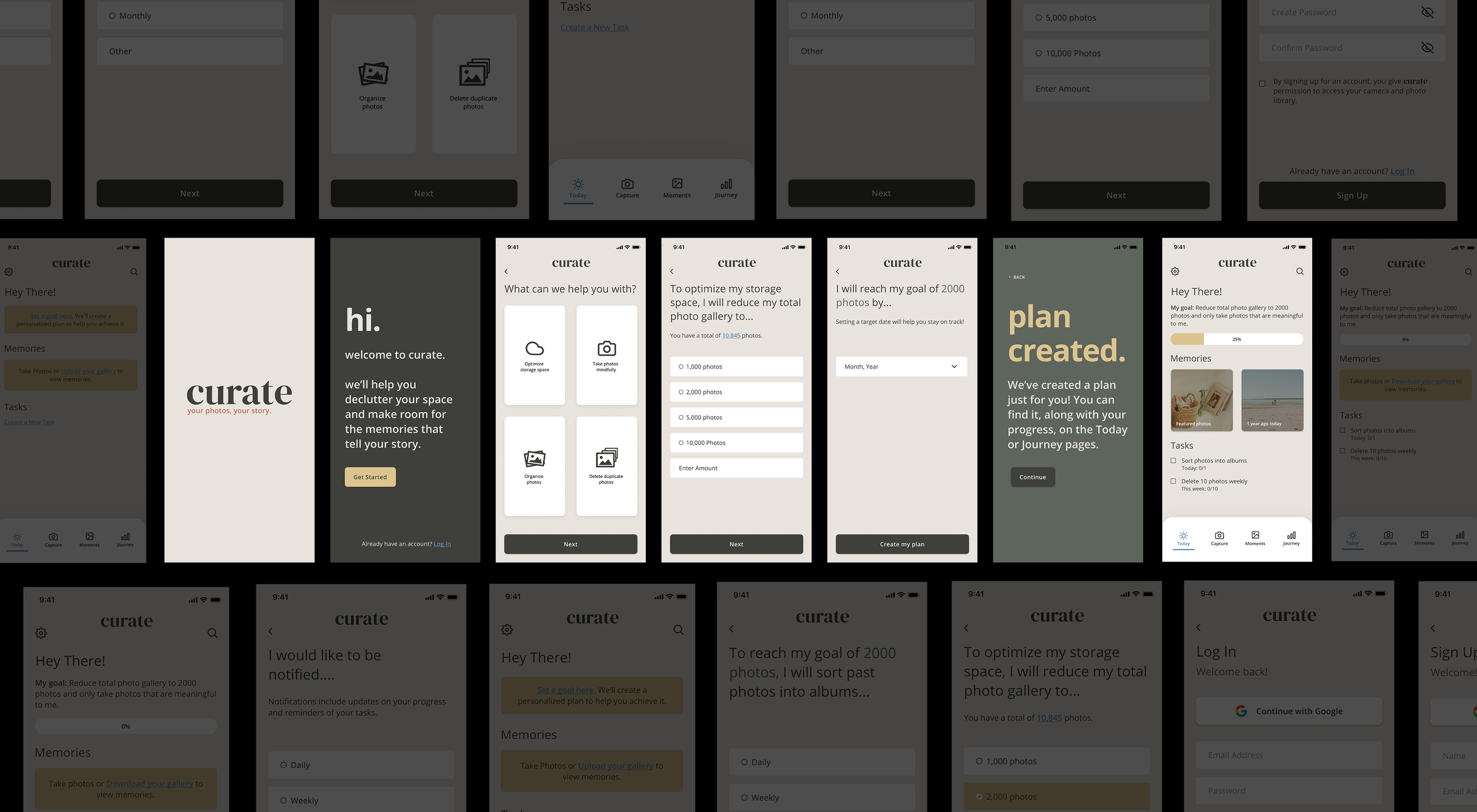
To move towards a prototype for testing, I created detailed mockups that modeled the 3 big ideas and the red route flows.
CREATING A PLAN
After creating an account, users are prompted to answer a series of questions. Using their questions, curate personalizes a plan that incorporates the photographer’s goals, tasks, and target dates.
2. ESTABLISHING PHOTO CRITERIA
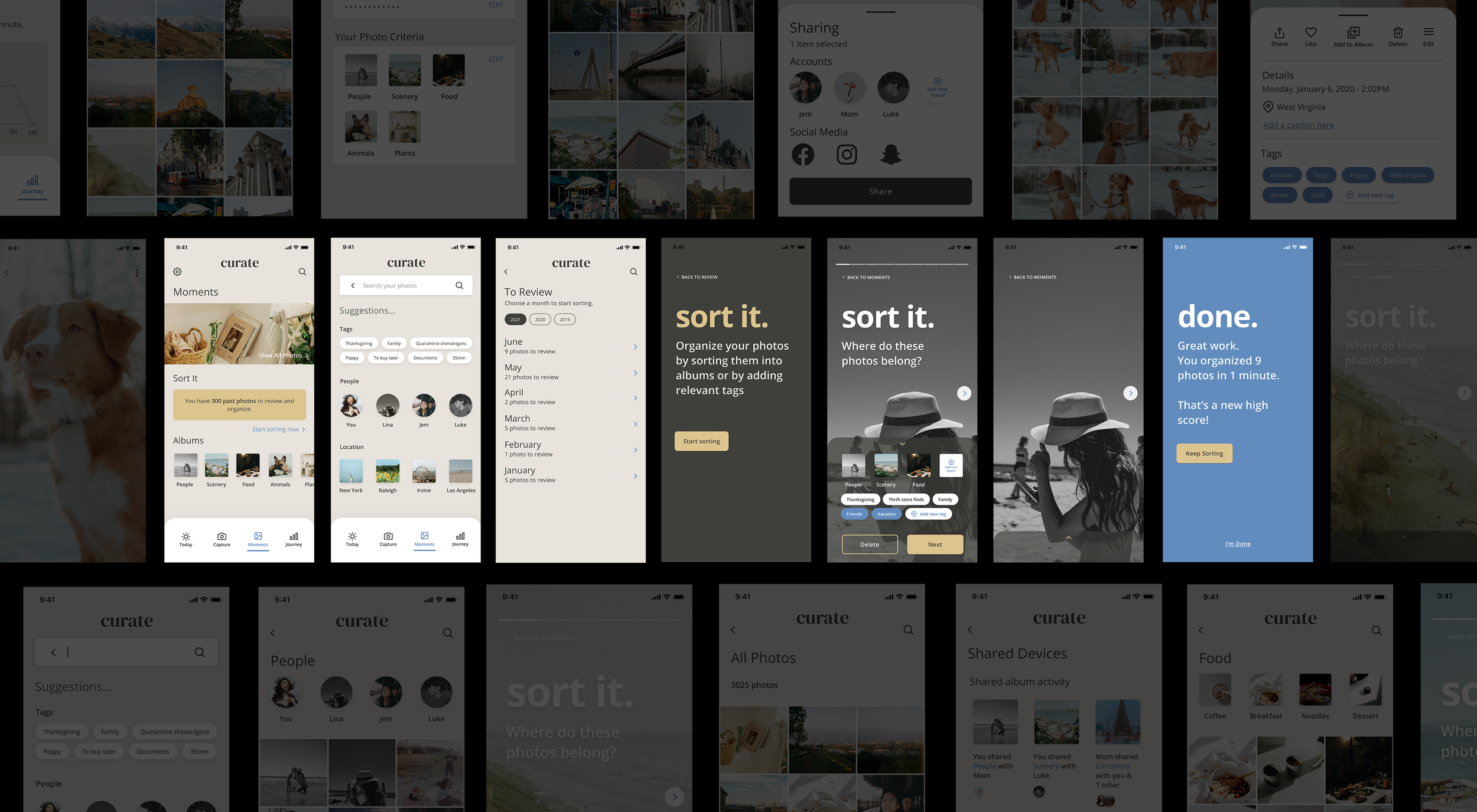
Users can choose from various categories to establish their photo criteria (AKA, the kinds of photos that mean the most to them). While taking photos, their photo criteria will be on the user interface to remind them of the photos that they want to take and keep. The photo criteria become the default albums in the user’s photo gallery.

3. LOCATING AND SORTING PHOTOS
Users can choose a section of photos to review from their photo gallery. The sorting feature allows for quick organization of photos into appropriate albums.
VALIDATION
Refining the designs
Usability Testing
I held 2 rounds of Usability Testing sessions, each with 5 participants. I also received feedback from mentors and sample hiring managers which I later implemented into the final prototype.
3 Key Findings:
Search Bar feature - interesting trend between older + younger participants regarding the interaction.
Onboarding process - participants did not know how many photos they wanted to reduce because they didn’t know the amount of photos they had off the top of their head.
Wording of certain sections - there was some friction between certain interactions with the app due to vague wording.
THE IMPACT
From concept to reality
While this was a concept project, most participants in my usability studies noted that they needed something like curate in their life to help them redefine the photos they take and keep, and encourage them to be more disciplined and organized.
User Testimonials
“I love how [curate] makes regular photo taking more intentional. I usually snap a photo and forget about it, but this makes you think and helps you organize.”
— Sarah
“I have like 20,000 photos. It’s so hard for me to find the one that I’m looking for. I think curate would be a really big help.”
— Jesse
PERSONAL LEARNINGS & REFLECTIONS
This was my first UI / UX project (yay!). I’m proud of the things that I created, with the help of mentors and peers, but know that I still have areas to improve on. I’ve included them below:
Timebox, add deadlines, and keep yourself accountable.
While my project did stall at certain points due to personal reasons, it was also slightly delayed due to procrastination driven by fear. As the User Experience Designer, I became the user’s advocate. I wanted to create something that helped the users, but I was scared that I would do it wrong. However, I realized that this was an act of self-sabotage. As Brianna Weist put it in her book, the mountain is you. Realizing this allowed me to shift my focus towards my end goal of representing the users and finally push through to the end of the project.
There will never be an end to UX Research and Design.
Before starting this project, I had this preconceived notion that after completing it, I would have a show stopping final product to showcase. While I do have a decent prototype, I know that there are still many areas that I can redesign, test, and improve on. The cycle never ends, which is what makes it so exciting.
Be confident and trust the process.
What nobody tells you about starting a UX project is the imposter syndrome and lack of confidence that can easily stem from it. I was a beginner with zero qualifications - no university degree, no work experience in the field. This pressure that I put on myself left me feeling vulnerable and intimidated by my future as a designer. Though obvious in hindsight, I slowly discovered (with the help of my peers and mentors) that becoming a designer isn’t something that someone is born with, or something that magically happens overnight. Like the UX cycle, it’s an iterative cycle of mistakes, more mistakes, growth, and so on.
Thanks for reading. If you’d like to chat more about curate or UX Design, send me a message via jadenabigailflores@gmail.com.
I’d love to hear from you!


