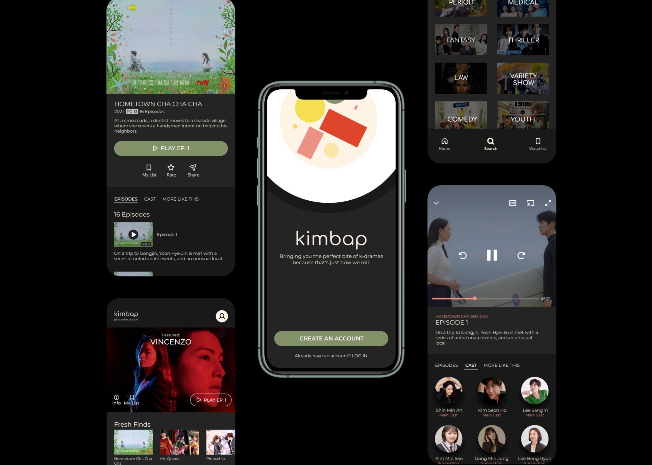
Kimbap is a subscription-based streaming service with a wide selection of Korean dramas.
OVERVIEW
Kimbap is an online streaming service that offers a vast library of Korean dramas. Like the popular Korean comfort food, Kimbap is your “perfect bite” of k-dramas, bringing a colorful arrangement of genres to the table.
PROJECT TYPE
Concept project created to explore and apply UI/UX Design practices and frameworks taught via Springboard
MY ROLE
UX Designer, UI Designer
THE CHALLENGE
How might we monetize a successful product?
Since their launch 2 years ago, Kimbap has established a healthy user base of free users. The company feels that now is the time to evolve the features offered in order to monetize the product. The overall goal of the project is to craft an experience that encourages users to subscribe and pay a monthly fee.
The high-level business goals were to:
Create an opportunity for new users to subscribe to the premium product upon registration in the signup flow.
Create the opportunity for returning free users to become paid subscribers in the sign-in flow as well as within the product (once logged in).
THE APPROACH
Context & Preparation
Because I mostly wanted to focus on the challenge of free to paid conversion, I kicked off the project by studying industry leaders that offered subscription-based services (YouTube, Spotify, Pandora, etc.). This laid the groundwork for my approach towards a solution.
I also studied the project brief. Here, the target audience was described as:
18-24 years old
Tech-savvy - on their phones for several hours a day
Budget-conscious
To keep the project on track, I created a detailed project plan with due dates and deliverables. I segmented the plan into 6 iterative phases:
Discover - Create a research plan, conduct a competitive analysis and a few user interviews, and write a summary highlighting the research findings.
Design - Design user flows, sketch screens, and build low-fidelity wireframes.
Validate - Conduct a combination of in-person and remote user testing interviews
Design - Design high-fidelity screens and prototype to prepare for test.
Validate - Conduct usability test sessions
Design - Incorporate feedback into final designs.
THE DISCOVERY
The Mediator
Without any pre-existing insights or research (other than the study of industry leaders), I conducted a competitive analysis of other online streaming services to understand how competitors had approached the problem. I then interviewed potential users and listened to the things they looked for when subscribing to a media service. Through this, I became the mediator, working to find a balance between business and user goals.
Competitive Analysis
Analyzing competitors allowed me to focus on the company/business goals of free to paid conversion and identify the types of flows and features that users would recognize to increase usability.
Viki
Viki is a streaming service that offers a broad selection of Asian TV shows and movies. Users can create an account for free or choose from 2 subscription plans to unlock additional content.
Crunchyroll
Crunchyroll offers Japanese anime and manga. Users can create a free account or choose from multiple subscription plans for additional features.
Hulu
Hulu offers a wide range of TV shows. To use the app, the user must sign up for a free trial or login to their paid account.
Chatting with users
To gain more empathy for users, I conducted short interview sessions focused on their perspective on paid subscription plans as well as the “why” behind the subscriptions they chose to pay for. Collecting information in this way pushed me to balance the high-level business goals with the personal, user needs.
“I always look at the extra features listed and sign up for a free trial first to see if I like it.”
— A.S.
“I like to see all the information [about the product] upfront. I want to compare prices and know that I can trust them.”
— C.R.
Key Findings
💡All 3 competitors included a “free trial” for their subscription product. This feature is especially important to users and can be one of the main factors that push them to actually commit and pay for the subscription.
💡It is important for the business to be completely transparent with the subscription’s benefits, prices, and additional details. Users stated that they were more likely to subscribe to a product if they could easily scan the prices and could find value in the product.
💡When choosing a subscription, users also look for: no ads, access to more content, access to content offline
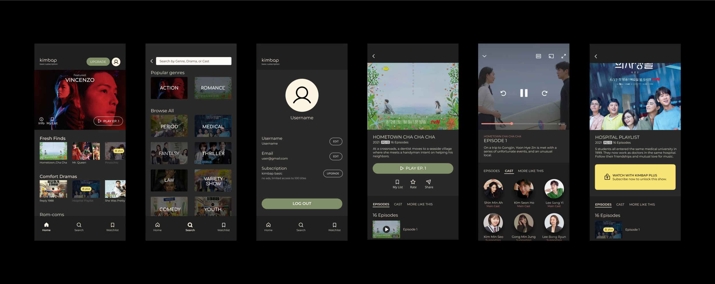
💡The opportunity to subscribe is carefully planted during most points of interaction. The main points where the subscription service was advertised were located on the following screens:
1. Log In/Sign Up - scannable description of plans
2. Home screen - top right corner, or as a banner near the navigation menus
3. Search/Browsing - content was labeled by different subscription plans
4. Profile - describes subscription status and offers opportunity to upgrade
THE FRAMEWORK
User Flows
Gathering the findings and insights, I created 2 user flows as a foundation for the design:
FLOW I: Create Account/Log In
Upon registration, the subscription plan is presented with actionable steps to subscribe.
FLOW II: Choose a drama to watch
Throughout this flow, there are opportunities for new/returning users to subscribe or upgrade their subscription to gain access to additional content and features.
Wireframes
I created 21 wireframe screens using what I learned from the research and the user flows as my base. I incorporated the opportunity to subscribe at various points of interaction - making it obvious, but not distracting from the experience (as demonstrated through the highlighted components below).
BRAND & STYLE
What is kimbap anyway?
Like the popular Korean comfort food, Kimbap is your “perfect bite” of k-dramas, bringing a colorful arrangement of genres to the table.
Because kimbap was a concept project, I created the brand and the style myself. The sans serif text is meant to represent the roundness of the kimbap roll and the comfort it brings to the consumer. The colors were sourced from actual ingredients (imitation crab, egg, cucumber, rice, etc.).
VALIDATION
Taste tests
I conducted 2 rounds of usability test sessions to understand how users would engage with the product. The first round revealed that the wording was oftentimes misleading. Additionally, the layout of certain sections made it harder for some users to consume the information and content. The second round revealed that the way locked content was displayed was inconsistent and anxiety-inducing in certain participants.
The main changes that I made during each iteration are represented below.
DETAILED DESIGNS
High-Fidelity Designs
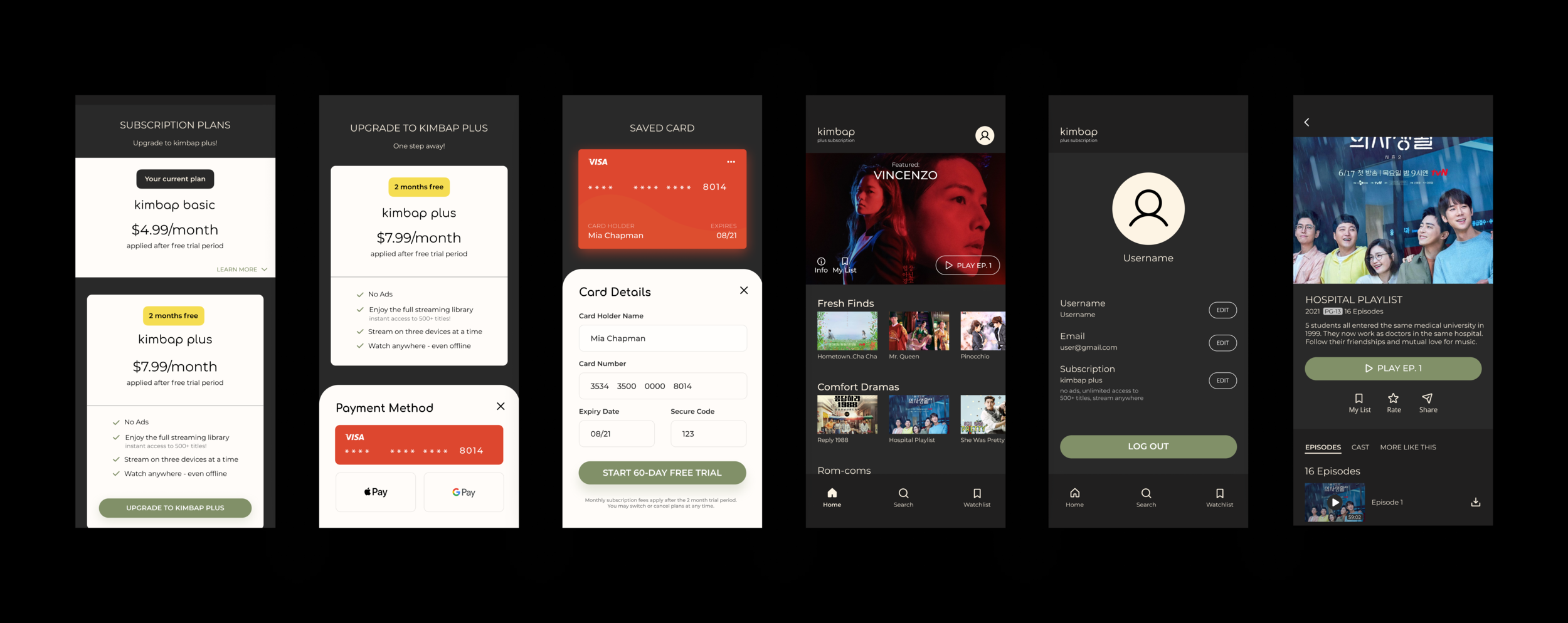
SIGN UP / LOG IN
After creating or logging into their account, users can choose to continue with the free plan or subscribe to the given subscription plans.

KIMBAP BASIC PLAN
The kimbap basic plan offers a limited selection of the streaming library. There are opportunities to upgrade to kimbap plus all throughout the experience.

UPGRADE TO KIMBAP PLUS
After interacting with the “UPGRADE” call-to-action buttons, users are then led to the following screens to access kimbap plus and its additional features.

THE IMPACT
Comfort food
All participants completed the given tasks and were able to subscribe/upgrade their accounts throughout the experience. While this was a concept project, a majority of participants of in the usability studies also stated that they would use this app. They especially liked the category titles when browsing (“fresh finds” and “comfort dramas”) because it was more relatable to what they usually look for in a TV show. In addition, 3 participants mentioned that the cast feature was very relevant to them and people they knew, as they would usually google the actors/actresses if they liked them. They appreciated the familiarity of the app’s navigation as well.
Based on the two rounds of user testing, the kimbap app worked as I intended and planned, ultimately fulfilling the business goals and user needs!
PERSONAL LEARNINGS & REFLECTIONS
With this project, I had the opportunity to work on a challenge that was more business-oriented than the previous projects. It focused on building a subscription model so as to monetize the existing product. I learned the value of balancing business goals and user needs. I had to find opportunities to encourage users to subscribe without being too pushy and causing them to leave the app.


