5 day design sprint for a new startup interested in helping parents find books to read to their children.
OVERVIEW
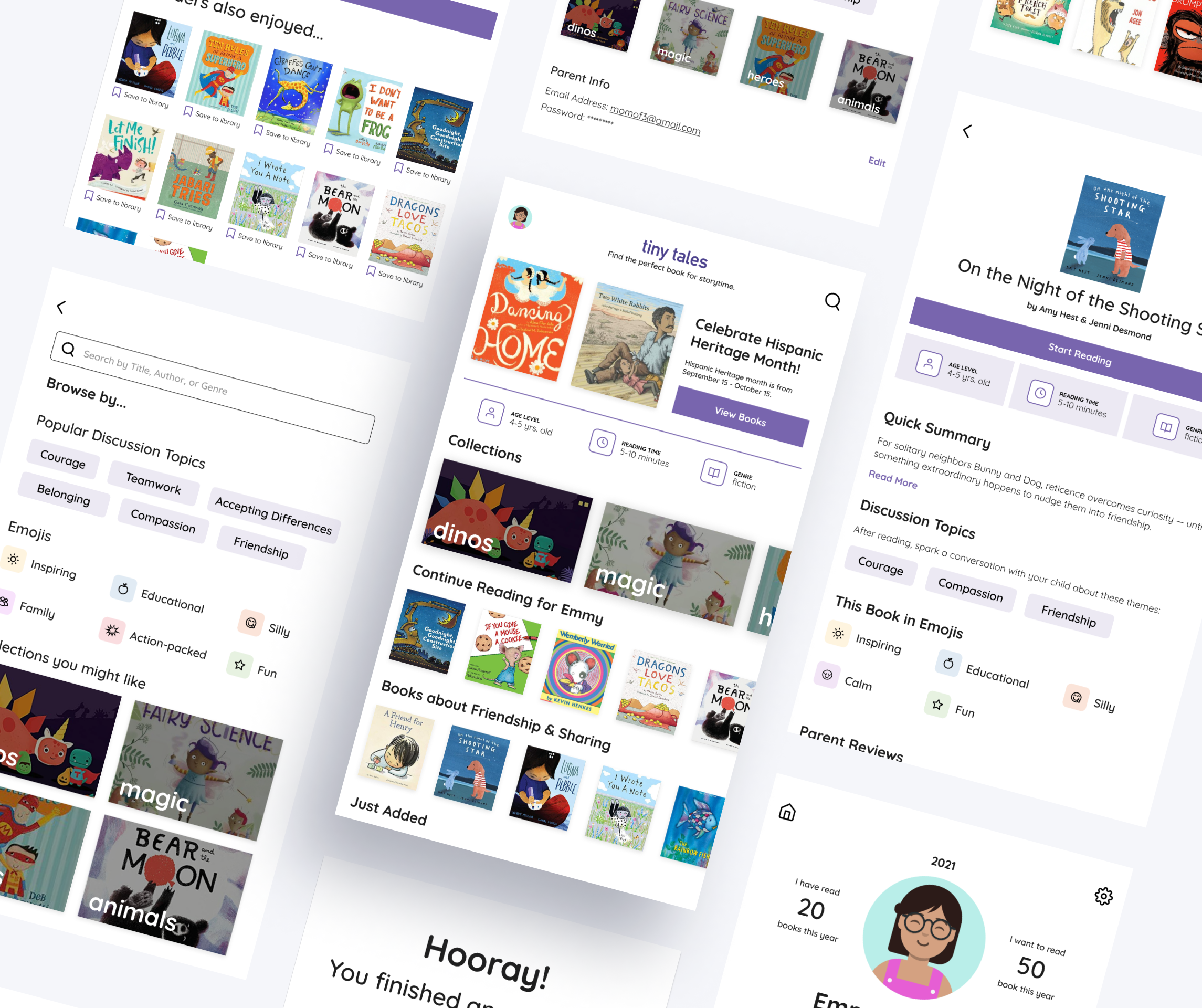
Tiny tales is a tablet app created by a new startup. It contains a wide collection of stories that parents can read with their children. Through newly designed features like advanced search filters, at a glance book overviews, and more, tiny tales assists parents in finding the perfect book for story time.
PROJECT TYPE
Modified version of the Google Ventures (GV) Design sprint used to develop quick and effective solutions. The challenge was presented by Springboard in partnership with Bitesize UX for an enhanced, hands-on learning experience.
MY ROLE
UX Designer, UI Designer
THE CHALLENGE
A Search for the Perfect Book
The Tiny tales app carries a library of short stories, illustrated books, educational books, and more for parents to read aloud to their children. However, as this library has gradually grown, users have mentioned that it’s been difficult and time-consuming to find the perfect books to read to their children. Through further user research, parents have explained that they choose stories they want to read based on a variety of factors, including but not limited to: the length of time they have allotted for reading, the comprehension levels of their children, specific topics their child is experiencing or is interested in, and more. They’ve reported that it often takes longer to find a book than it is to read them.
My overall goal was to discover ways to make the process of selecting books for story time easy and enjoyable.
THE APPROACH
Design Sprint
In his book, “Sprint: How to Solve Big Problems and Test New Ideas in Just Five Days”, Jake Knapp describes a design sprint as:
“The ‘greatest hits’ of business strategy, innovation, behavioral science, and more — packaged into a step-by-step process that any team can use.”
In 5 days, this Design Sprint helped me to:
Understand. Map the problem and choose an important area of focus.
Ideate. Sketch solutions with pen and paper.
Decide. Make decisions, turn ideas into a testable hypothesis, and create a storyboard.
Prototype. Build a realistic prototype.
Test. Get feedback from target users.
DAY 1: UNDERSTAND
Gathering the Research
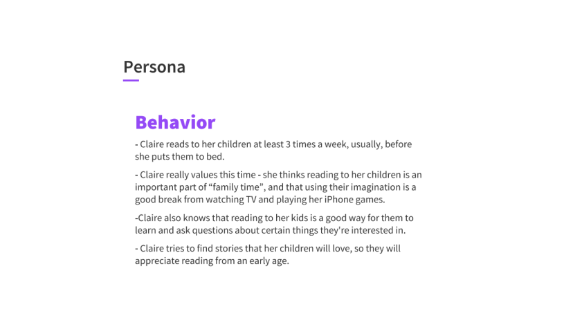
Before joining the project, the tiny tales UX Research team conducted a series of interviews and crafted the persona of Claire to gain a perspective similar to the end user.
Claire is a mother of two. She usually reads with her kids a few times a week, before bed. To keep them engaged, she tries to look for stories that are interesting, educational, and fit for both children’s comprehension levels. However, she often finds herself spending more time browsing for books, than actually reading them.
⬇️Read more about Claire below


From the interview notes and recordings, I collected relevant user quotes and assembled an affinity map. This helped to uncover a few insights about the users, the target audience, and the problem space.
Findings and insights:
💡Target Audience: Parents/Caregivers of children looking to read with their kids
💡Story time is important to the users because it’s a way to have more quality time with their kids and a way to get them more excited and confident about reading and learning.
💡To choose books, some parents allow their kids to find a book topic that piques their interest and then select a book within that genre according to the child’s reading comprehension level, the story length, and important messages/themes conveyed. Other parents look to opinions from friends or family with similarly aged children on recommendations for books.
💡Users are frustrated with finding a story that aligns with their child’s specific needs and preferences. This causes them to spend more time looking for a book than actually reading it to their children.
Taking it a step further with Contextual Inquiry
Because I work directly with kids at the YMCA, I decided to set up a portion of the program space as a reading nook. By doing this, I was actually able to observe how kids found books to read. I observed that many kids flipped through the available books and chose ones with topics that they were currently interested in (like dinosaurs, nonfiction, Trolls the movie, and more). This additional research aspect allowed me to further explore the problem in context.
Visual Thinking
With the identified user pain points and needs in mind, I created a map to visualize the flow of the experience. This flow follows the journey of the parent and child as they successfully find and read a book using the tiny tales app.
The “How Might We…” (HMW) questions focused my attention on the business and user goals.
HOW MIGHT WE…
Help readers find books more easily?
Make the process of finding books more engaging and enjoyable?
Show preferences like reading comprehension level, story length, summary, etc. in a scannable, preview-like way?
Taking the time to identify the surface area of the problem space and set a project goal helped me prepare for Day 2 of the Sprint, where I would begin the sketching process.
DAY 2: IDEATE
Lightning Demos
After understanding the problem space, I conducted a series of lightning demos to explore products that developed solutions for choosing a book to read.
I selected 3 apps - Goodreads, Book of the Month, and Libby - which included features that made the process of discovering new books efficient and enjoyable.
Home 1
Home 2
My Books
Search
Goodreads
“Search” page provides popular genres to explore
“My Books” page includes a summary of what you are currently reading, what you want to read, and what you’ve already read. It also shows your different shelves
“Home” page features different categories of books and also includes a section celebrating books about the monthly theme. In this case, it’s Hispanic Heritage month
All books
Book Overview 1
Book Overview 2
Book Overview 3
Book of the Month
“All books” page separates books into categories such as “popular right now”, “recent add-ons”, “most loved”, etc. Each book is labeled with the genre name with occasional tags that indicate whether it is a debut, early release, or award finalist book.
After tapping on a book to view more info, the app gives a rundown of the book through various sections: “Quick take” (1-2 line summary), “Good to know” (interesting info in the form of “bookmojis” as BOTM describes it), detailed “synopsis”, and “member ratings”.
The way the information is presented is easily scannable and a good brief of the book before the reader buys it.
Home
Search
Advanced Filters
Book Overview
Libby
“Search” page suggestions - easy tags indicating the number of books in each category
“Home” page includes info about the monthly theme - Hispanic Heritage Month
Advanced Filters - subjects/genres
Book Overview includes synopsis, tags, timeline, and more.
Solution Sketches
With these features and the research synthesis in mind, I narrowed the solution down to the 3 most important screens the app should have:
Home - contains quick view of user’s library collection and a discovery feature to find new books
Book Overview - contains an at-a-glance overview of the selected book with important information for the parent to look over.
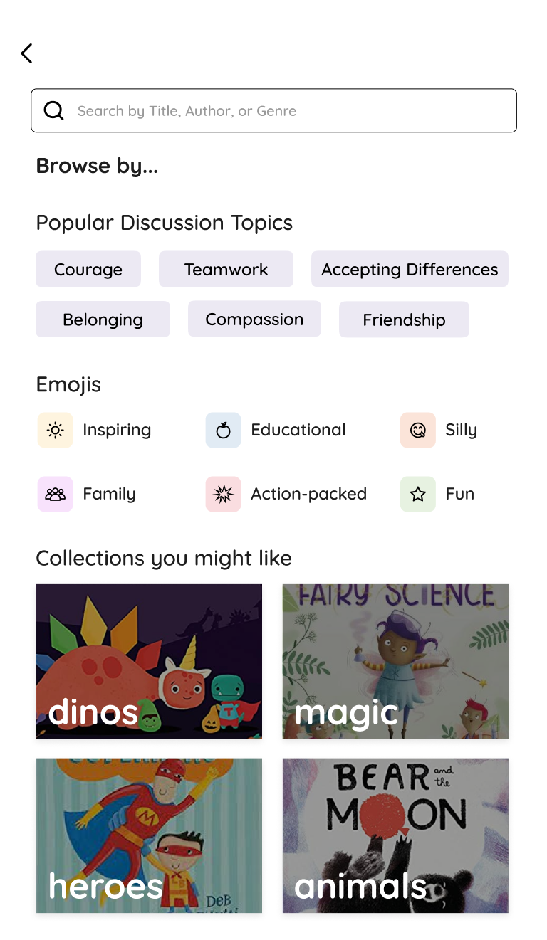
Search - includes smart suggestions/filters to help users find a book to their preferences
I then began the sketching process. To do this, I conducted 2 rounds of crazy 8’s - an exercise in which I sketched a set of 8 screens in 8 minutes - which helped me to prioritize the most important screens and features.
The homepage consisted of various collections that parents could scroll through to discover new books - an easily accessible “continue reading”, “popular books”, “celebrate hispanic heritage with featured authors”, etc. Upon selecting a book, the user is brought to a one page overview of the book including information like a one-line summary, icons+tags, age level, reading comprehension, story length, reviews, and more. The search page includes suggestions and filters that users can select to find a book.
With these key features in mind, I began to work on the solution sketch. The overall goal I established during Day 1 of the sprint remained at the forefront of my mind:
How might we make the process of selecting books more efficient and enjoyable?
The solution sketches include a categorized homepage, advanced search filters, and a book overview page with all of the necessary information that parents frequently look for.
DAY 3: DECIDE
Creating a Storyboard
After reviewing the sketches from day 2, I began to form the storyboard, focusing on the 3 big ideas from my solution sketches. The storyboard served as a visual representation of the actual flow of the prototype, pushing me to prioritize the essential screens and features. I focused on creating an easy-to-use interface that was engaging for both the parent/guardian and child.
DAY 4: PROTOTYPE
Balancing Act
As I started to bring the sketches to life, I decided to tweak a few of my solutions to increase usability. I looked at various examples like the apps from my lightning demos, as well as apps with exemplar browse and search features (Netflix, Disney+, and Apple’s App store to name a few). I focused on balancing the necessary content (discussion topics, summary, age level, etc.) with the playful and colorful content (emojis, collections, profile page, etc.) to keep the app engaging for both the parent/guardian and the child.
The 3 screens - Home, Book Overview, Search - from the solution sketches (Day 2) are attached below.

Home

Book Overview

Search
DAY 5: TEST
Finding the perfect book
Using the prototype created on Day 4, I tested the prototype with 5 parents within the target audience and had them all perform the same primary task, along with a few other basic tasks. I also held a quick debrief afterwards, where the participants were allowed to freely share their overall thoughts of the design (usability + style wise).
Primary Task:
Since school started, your child has been having trouble making friends. You think that it might be best to read a light and silly book with your child that encourages them to engage with others at school. Find a book for you and your child to read together.
Secondary Tasks:
Interact with the book overview page and tell me your thoughts - would you choose this book based on the information shown?
Check your progress while reading the book.
Finish the book and view additional book recommendations.
Rate the book.
View your child’s library
View profile settings and preferences.
All parents completed the given tasks. Many provided positive feedback, focusing on the bright and kid-friendly feel of the app in particular. Parents especially enjoyed the way the information was presented in the homepage as well as the “parent reviews” section, with one participant noting that she would typically look to external sources for reviews, and was happy that she didn’t have to do that with TinyTales.
One area that I noticed friction and confusion with was Secondary Task #3. Some participants were not able to find the book recommendations, until I noted that they could interact with the page by scrolling. Because it was not obviously shown, the book recommendation feature would’ve been overlooked if I had not prompted the users to find it. In addition, finding where to tap in order to display the top/bottom navigation menus used to check the page number of the book proved to be a somewhat difficult task for a few participants. In future versions, I would add a few tutorial screens to point the users in the correct direction, and make the recommendations feature more visible to the user. If I were to continue the design sprint and ideation process, I would focus on making some elements (like the recommendations feature and the navigation menus while reading) more noticeable and accessible.
NEXT STEPS
Moving Forward
Since many users from the research interviews mentioned that they often let their child choose a book to read before looking into the book’s content and reviews, conducting further research into how kids themselves go through this process might be a worthwhile approach.
In a future version of the app, I would like to use this research to implement a more immersive and interactive experience for the child, focusing primarily on the child’s choice to freely browse and pick from a set of curated books (according to parent preferences) to grow their confidence in their own decision making while also meeting the parents’ criteria (age level, reading time, discussion topics, etc.). I would also like to conduct more research to accommodate kids with differences in learning styles and promote accessibility and inclusion.
PERSONAL LEARNINGS & REFLECTIONS
The fast-paced structure of the design sprint really pushed me to zero in on the most important parts and features. There was no time to question or perfect the design - just enough to test it and receive feedback, which is what really matters the most.
Designing a kid-friendly app that also served the parent/guardian’s high-level needs (like being able to quickly see if the book aligns with the child’s comprehension level, interests, and needs) was exciting, yet familiar. As a site coordinator at my local YMCA, I am constantly interacting with kids aged 4-13 and communicating important information with their parents/guardians. This experience turned out to be very helpful when putting together my “final” (with UX Design, I’ve found that no solution is every final) solution, as I was able to better understand the perspective of both the parent/guardian and the child.
Based on the round of user testing, I can say that the tiny tales app worked as I intended and planned, ultimately fulfilling the business goals and user needs!


